Renovation Diary: Creating Beautiful Banquette Seating
How to navigate creating zones in an open floor plan. The Wall-less Room is what we will be discussing this week at Victory Farms. This was my toughest challenge on this project! The prior owner used this open space to accommodate a dining table. The only other seating for meals was the kitchen island which was separated by a living room. This space not only didn’t make sense in the overall layout of the home, but was literally on top of the entryway that leads to an open concept living room and kitchen.If I completely removed any dining space I would only have the kitchen island to seat guests. With this being a 2,200 square-foot home, I wanted to make sure my client V had a place to not only use for extra dining space, but a place to kick off your shoes and enjoy family games.The challenge was to make the space feels natural and comfortable and not out of place. The best solution was banquette seating.
As a reminder, here is the space before:
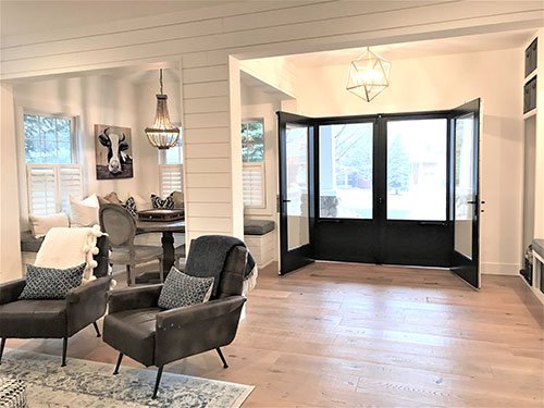
And here is the space now, with beautiful banquette seating in the dining area!
Before meeting with V, I wanted to have a couple of different ideas that would give her not only extra seating, but a space that would flow with the entire level. I drew my ideas up on my Virtual Design Software and then met V at the job site so I could go over my vision for this space.We discussed a couple of options. First up was a room framed in with glass walls. I showed my client how glass would keep this small space open and airy. The design also opened up one side with sliding barn doors, or as another option, opening up on two sides, one facing living room and other facing entry. She did love this idea, but it was extremely expensive.The second less-expensive option was to build a room with no walls but to add features that separated the space from the entryway. After reviewing my ideas and researching pricing there was really only one choice that would fit the budget, "The Wall Less Room". Since it was too expensive to frame in the space with glass barn doors, my vision was to add vertical support structures to the existing horizontal structure beam. I also added a thick column floor to ceiling to give the eye symmetry when walking through the entry. The design also called for adding a header beam between the entryway and the new room. This would give the illusion of a wall and separate the entry from the new dining space.To help the new support structures blend in and become a natural feeling, I incorporated shiplap that flowed into the existing structure beam that currently went horizontally across the ceiling from one side of the home to the other. Since the entryway walls, structure beam, and the kitchen structure beam were all shiplap this helped the new structures tie in together and make a statement.
The cost of this idea was minimal because framing materials are cheap and the build-out did not require a lot of finish materials.While framing was in full progress, my next step was to discuss dining furniture ideas. Because this space had two exterior walls of windows my first thought was to build banquette seating. The new space was pretty square, so I sent round table options to pick from since the custom bench seating would also be pretty boxy. Added storage was needed so I asked my finished carpenter Greg to make the custom banquette seating open, which was a winner!Once Greg had these benches built, I met with my seamstress Jodi and had her make bench cushions that matched the cushions I used for the entry built-in as seen in last weeks blog. These rooms were open to each other since they shared the entry, so fabric needed not to compete, but to flow.
I also had Jodi make several custom oversized down pillows to place on the benches to soften and cozy up the area. I chose solid off-white and saddle colored faux cowhide fabric for the pillows to pop the blue blended cushions. This really gave us the farmhouse look! To decorate the space, I added a fun wood beaded chandelier from Antique Farmhouse, a fun cow print picture from a local vendor and throw blankets from West Elm for some added design and warmth. Lastly, the space received a personal touch by adding a wooden vintage Scrabble game to the table top which was given to V by her amazing parents.Wow! This space was now a centerpiece awaiting some memorable good times. Next week we are going into the living space and kitchen. Hope you enjoy…stay tuned for more of "Victory Farms".If you're interested in remodelling or renovating your home, check out The Flippin Designer's interior design and project management services!


